Everyone knows that the standard computer keyboard has a little more
hundreds of keys, which means it cannot display all the characters that
used by humans in everyday life. But not everyone knows that
in addition to entering the characters that we see on
your keyboard, Windows allows you to use other symbols as well. For example:

But
despite the fact that these (and many other) symbols are not on
keyboard, we can very easily use them when typing our
texts. Let's try to do this...
Let's assume the simplest option - we type text in Notepad ( Start - All Programs - Accessories - Notepad) and we need to insert a copyright symbol into the text:

In order to do this we need to open the so-called Symbol table, which exists in the operating room Windows system. It's very easy to do this: Start - All Programs - Accessories - System Tools - Character Table.
A table of symbols will open in front of us Unicode, in which we need to find the symbol we need:

After this, you need to click on this symbol with the left mouse button, then press the button Choose and a button Copy:

This will copy the selected symbol to the clipboard.

After this, the symbol we need will appear in the text:

As you can see, there is nothing difficult about this! This is the simplest and most understandable (on
my opinion) method, although you can slightly change the order of actions and
enter characters without opening Symbol table. To do this, you just need to know a certain key combination.
The fact is that in Windows many characters are assigned unique code, which is entered using the key Alt.
For example, to enter the same copyright symbol you need to press the key combination Alt+0169, i.e. press (and hold) a key Alt, then press the number keys 0
, 1
, 6
And 9
.
Please note that when the key is pressed Alt
numbers on the main keyboard field can be blocked, and therefore, for
You can use an additional keyboard field to enter numbers
(having previously turned it on with the key NumLock
You can see which key combination corresponds to the selected symbol in the lower right corner Symbol tables:

If you use some symbols constantly, then I
I recommend creating a reminder for yourself (a table with a description of often
codes used) and print it on a printer. For example, like this:

But keep in mind that not every symbol from the table has a similar
combination and therefore some characters must be entered as described above
way.
To make it easier for you to find the desired symbol in the table,
you can use additional options and view
symbols by groups.
To do this, check the box Additional options
and then select the desired options in the fields Character set And Grouping. For example, this figure shows how you can display only numeric characters:

Or, for example, you can display only the Windows “Cyrillic” encoding that is convenient for us:

Well, in conclusion, I would like to note that some programs have a built-in ability to insert special characters.
For example, in the menu Word programs you can choose Insert - Symbol(photo from Word 2010):

This greatly speeds up your typing, because... there is no need to resort to the Windows symbol table.

I just bought a font and now they say I need to go to Illustrator and go to my "glyphs" to get "additional" fonts....well I don't have Illustrator...nor do I know with glyphs?!
Does anyone know if the PS6 has glyphs? the font was purchased: https://creativemarket.com/L_Worthington/12122-Charcuterie-Cursive
b1nary.atr0phy
CC has a glyph bar, CS6 doesn't.
Answers
Scott
"Glyph" is simply a term for a specific character in a font file.
Photoshop, unlike other Adobe applications, does not have a Glyph panel. While it can display and use glyphs if they are present, there is no way to access a specific glyph from Photoshop.
Both Illustrator and InDesign have glyph panels that allow you to see and use all the glyphs present in a font.
So the short answer is... Photoshop doesn't have access to glyphs.
There are also many free/shareware applications that can display glyphs in a font file. To use a specific glyph in Photoshop, you need to find an application, any application that allows you to see the glyphs. Then just copy/paste the glyph from this application into Photoshop.
You may already have an application that can display glyphs. For example, you can use Insert > Symbol in Microsoft Word, to view glyphs in a font. The Word simply calls them "symbols". Then copy/paste required file in Photoshop.
Phlume
As mentioned, Photoshop doesn't have a Glyphs menu.
However, there are OS system tools that you can use to extract these characters from a font file.
Windows has a Character Map utility that you can use to copy directly from that program into a text box in Photoshop. To access your character card, you go to...
Start> All Programs> Accessories> System Tools:

netpraxis
If you're using a Mac, the easiest way to find the glyph you need is to use the app Font Book(included in standard OSX installation)
Select " View" > "Repertoire" in the application menu and select a font to display all included characters.
Click to select any of the displayed glyphs and copy/paste back into Photoshop

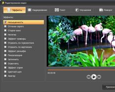
Basics of working with the tools of the Text group in Photoshop: control panel, settings, functions and capabilities.
The group is located on the toolbar under the button with the letter “T”. Open it in any way:
- by clicking on the black lower right corner of the icon;
- by right-clicking on the icon
You can activate Text by pressing the T key (Russian E) on the keyboard. And it doesn’t matter what keyboard layout you have at the moment. While holding down the Shift key, pressing the T key several times will alternately activate all four tools in this group.
Fig.1. Text tool group
Everything here is intuitive.
- Horizontal – to create the usual recording in a horizontal position.
- Vertical – places the inscription from top to bottom.
- and 4. Create quick masks with horizontal and vertical selection.
The horizontal direction is used most often.
Text tool group control panel
When the tool is active, the top control panel looks like this:
Fig.2. Top toolbar Text
IN Photoshop versions CS6 introduced a Font menu containing several options for settings. This will be discussed in another article. Now let's look at the settings top panel management.
Attention! It is better to set all the settings of the top panel for the Text tools in Photoshop before typing the inscription. But you can make changes later by first selecting the text or part of it that needs to be changed.
- Above number 1 Fig. 2 – saving parameters. A very convenient function for saving the settings (font name, size, etc.) if you need to return to them periodically or before rasterizing a text layer.
Click on the small arrow to open the window. Select “New set of parameters for tool. A second window opens where you can set a name for the parameter. Click OK. The editor remembers the settings.

Fig.3. Saving text parameters in Photoshop
A new line appears in the list. For clarity, in the previous step the name “Example of a new save” was entered.

Fig.4. Saved Settings
Now, to set on the panel all the values that were there when saving, you need to click on this line.
To delete a line, right-click on it and select delete.
- Above the number 2, Fig. 2 – change text orientation. Pressing the button with the letter T and arrows - the direction of the inscription changes from horizontal to vertical and back. Don't forget that this text layer should be active in the Layers palette.
- Above the number 3 Fig. 2 – font typeface. Clicking on the arrow button opens the entire list of fonts available on your computer. You can select the one you need from the list or enter it into the window manually, then press Enter.
- Above the number 4 Fig. 2 – font style. The arrow button opens a list of styles that the selected font supports. If the button is inactive, then the selected font supports only one suggested style.
- Above button 5 Fig. 2 – font size, aka Kegl. The drop-down list offers options from 6 to 72 pixels. You can enter any of your values into the window manually, then press Enter. It is enough to enter only numbers, and the editor will insert the letters “pt” automatically.
You can select the size like this: move the cursor to the left of the window when it looks like a finger with arrows, hold down with the left mouse and drag to the right to increase the size or to the left to decrease it. The digital value in the window will change. As soon as you release the mouse, the text size will change.
- Above the number 6 Fig. 2 – font style. Clicking this button opens a list of styles that the selected font supports: italic, bold, bold... Not all fonts support full list styles, so there may be a different number of options. If the button is not active, then the selected font supports only one suggested style.
- Above the number 7 Fig. 2 – text alignment on one side or in the center. The buttons work the same way as in Word document. The settings are in the Paragraph panel. Read about it below.
- Above the number 8, Fig. 2 – color selection. The box shows the color that will be applied to the text. You can change it by clicking on this window and selecting any other one in the palette that opens. If the text has already been entered, then it must first be selected.
- Above the number 9 Fig. 2 – text deformation. Click on this button, then open the styles and we have various deformation options. Experiment.

Fig.5. Warping text
- Above the number 10, Fig. 2 – opens/closes Character, Paragraph panels. More about this.
Character, Paragraph panels
The Character and Paragraph panels open in Photoshop using the button on the top control panel or on the right panel. If they are not on the right panel, turn on the Window menu along the way - select Symbol or Paragraph. The corresponding icons appear on the right panel. If they are both selected, two icons of the same group will appear, but when you open any of them, there will be two tabs in the window for convenient switching between these panels.
Attention! The Character panel, when working with the tools of the Text group, has priority over the Paragraph panel.

Fig.6. Character, Paragraph panels
Symbol panel
Some of the settings on this tab duplicate the functions of the top control panel and have already been discussed. Let's not repeat it. The values in them will be set to the same ones that you set in the top panel - font, its size, etc.
The rest are indicated in Figure 6 above:
- Line spacing. Defines the spacing between lines.
- Kerning to adjust the distance between two characters. For example, out of the entire text, only two characters need to be brought closer or further away from each other. We place the cursor between them, open the list and select the desired option, or enter it into the window manually.
- Character spacing to set the distance between text characters.
- The vertical scale for increasing/decreasing the height of characters is set as a percentage. Enter the number into the box manually. You don't have to put the % sign; Photoshop will put it in automatically as soon as you press Enter.
- The horizontal scale stretches/compresses the stitching. Just like the previous parameter, it is entered as a percentage.
- Baseline offset. A convenient function when introducing mathematical formulas and other notations with superindex and subindex. It allows you to raise/lower part of a line or word. This part must first be selected. Enter the value into the window manually. The next line provides similar opportunities – pseudo-parameters.
- Pseudo-parameters. The font settings in this line are clearly visible - bold, italics, capitalized text, etc.
- Ligatures, that is, symbols that are obtained by merging several letters or characters, that is, combining them into one character. Very rarely used. Only those that support the selected font will be active.
- Opens a list of languages for spell checking.
Paragraph panel
Setting paragraph parameters such as indentation, wrapping, etc.

Fig.7. Paragraph panel
In the first line, the first three buttons are duplicated from the top control panel. They have already been discussed. The remaining buttons will most likely be inactive. The next three buttons on this line are designed to align the bottom line of text, and the last one is to align the entire width.
The second block contains three windows where you can set in pixels the indents from the right or left edges and the indent of the first line.
The third block indicates indents before or after the paragraph
In the next block, automatic stitching is enabled/disabled.
Use the Glyphs panel to insert punctuation, superscripts, subscripts, currency symbols, numbers, special characters, and glyphs from other languages into text in Photoshop.
To open the panel, select Text > Panels > Glyphs or Window > Glyphs.
Glyphs panel
A. Recently Used Glyph Slots | B. Selecting a font family | C. Selecting a style | D. Selecting a font category | E. Glyph Slots | F. Zoom out | G. Zoom control | H. Zoom in | I. Zooming out glyphs | J. Zooming in on glyphs |
- To change the glyph in the active text layer, follow these steps:
- Select where to insert the glyph using the Text tool.
- Double-click a glyph in the Glyphs panel.
- The Glyphs panel supports Latin, Greek and Cyrillic alphabet. Limited support for Hebrew, Arabic and other complex scripts such as Indian.
- For each font, the glyphs are organized into different categories, such as Basic Latin, Extended Latin A, Extended Latin B, Numerals, Currencies, Symbols, and many more.
- Glyphs are also organized by which OpenType features they support, such as: Alternates, Ornaments, Extended Ligatures, Numerators, Denominators, Style Sets, Monospace Digits, Ordinal Numbers, and many others.

A. Font category | B. Script | C. OpenType Features
- The Glyphs panel automatically finds alternatives for the first selected character in a piece of text.
- Glyph slots with a solid black rectangle in the lower right corner indicate that there are options for that particular glyph. These options can be viewed in the pop-up menu. To open it, click and hold the slot or click and hold on it Alt key or Option. Drag the mouse pointer over a glyph variant and release it to paste it into the active layer.
Glyph slot with a solid black rectangle in the lower right corner

Glyph options

Glyph Details
- The slider at the bottom of the dialog box allows you to increase or decrease the size of the glyphs in the panel.
- The Font menu is an expanded menu containing the same items found in the Character and Options panels. However, font search is not supported.
- When multiple fonts are in a selection on a Text layer, the Character, Options, and Glyphs panels do not display the font.
- You can work with the Glyphs panel without initializing a text layer.
As you add glyphs to your document, they are automatically added to the recently used glyphs row at the top of the Glyphs panel. Recently used glyph string:
- can contain up to 25 different characters. When the 25 character limit is exceeded, new glyphs are added to the left and previous glyphs are removed from the right.
- contains the same characters. The symbols do not change when the program is launched at different times.
- preserves the style of the glyph and does not take into account its style in the Options, Character, and Glyphs panels.
- determines the point size, color, and other values of the glyph according to those in the Character and Options panels.
what will happen in the end
In this tutorial we will create a set of icons in Photoshop. A set of icons must have the same background and theme. For practice, we will create icons with a sun, a snowflake and an RSS icon. Let's get started.
1. Preparing the work area
Step 1
Let's start by creating a new document sized 350 px by 350 px. Click in the white square next to the settings Background content(Background Contents) to select new color work area background.
Step 2
In the dialog box Color palette(Color Picker) select gray workspace background (#e0e0e2).

Step 3
It's always good when work is structured from the very beginning. Create a layer group and name it "Sun"(Sun). All layers related to the creation of the sun icon will be placed there.

2. Create the base
Step 1
Using a tool "Rectangle with rounded corners"(Rounded Rectangle Tool) draw a rectangle with dimensions 83 px × 64 px and set the radius to 8 px. To get a more accurate result, use the panel Properties(Properties). Here you can simply enter the exact dimensions.

Step 2
Hold Shift and then draw another rounded rectangle. This new shape will be added to the previous one. Set its size to 36 px × 36 px with a radius of 3 px.

Step 3
Press ctrl+T to transform the shape, and then click and drag outside the bounding box to rotate it 45°.

Step 4
Make sure the shape is in the center of the previous rectangle. In CC 2014, you can check the position of a shape by dragging it and snapping it to the guide at the center of the previous shape.

Step 5
Press Enter to save the result. You may find that a confirmation dialog informs you that the shape will turn into a regular path. This means that you will no longer be able to edit it using the Properties panel. Just click "Yes"(Yes).

Step 6
Position the shape as shown in the image below.

Here is the result at 100% scale.

Step 7
Draw a similar shape on top of the previous one, which is 1 px smaller. You can do this by duplicating the shape and then changing its points, or simply creating a new shape.

Step 8
Set the color to #57adf8.

Step 9
Double click on the shape and then apply Stroke(Stroke) and Gradient overlay(Gradient Overlay) using the following settings.

For the gradient, use the following color arrangement. To open the Gradient Editor and change the Gradient settings, click the Gradient Preview window.

Step 10
Reduce level fills(Fill) up to 11%. The layer's contents will be transparent and remain unchanged.

Here is the result.

3. Shadow
Step 1
Create new layer under the base. Activate the tool "Brush"(Brush Tool) (B) and then draw a shadow under the icon.

Step 2
Still using the tool "Brush"(Brush Tool) (B), add a stronger shadow just below the tip of the icon.

Step 3
Hold CTRL and click on the smaller icon to select the smaller shape. Create a new layer and use white color over the selected area. Make sure you use a soft brush Rigidity(Hardness)-0%.

Step 4
When you're done, deselect (Ctrl+D) and make it smaller. opacity(Opacity) layer.


Step 5
Create a new layer and select the smaller icon base again. Fill the selection with a white to black gradient. Change blending mode(Blend Mode) layer on Overlap(Overlay) and then reduce it opacity(Opacity).


Step 6
Add another layer. Create a large elliptical selection at the bottom of the icon, and then press Ctrl on the base layer to intersect it. Fill the selection with a white to black gradient. Change blending mode(Blend Mode) layer on "Screen" Screen and make it smaller opacity(Opacity).


This is what the result looks like at 100%.

Step 7
Hold Ctrl and click on the base layer thumbnail. Create a new layer on top, then select Editing > Stroke(Edit > Stroke). Set the color to light blue and width(Width) 1 px.

Below you can see the difference before and after adding a stroke inside the icon.


Step 8
Add a mask to the stroke layer. Fill it with black to hide all the outlines. Draw white lines over some areas to show them off. Thus, now we have the edge of the icon selected.

In the image below you can see the edge selection in detail.

Step 9
Add an adjustment layer Color balance (Color Balance) above the icon. We use it to change the background color.

To make it easier to manage layers, let's change the layer name to Color change(color changer).

Step 10
Fill the adjustment layer mask with black. Select the base of the icon and then fill it with white. This way, the adjustment layer only affects the icon. Drag the sliders to change the color.


Step 11
Duplicate all layers of the icon base and change the parameters in the adjustment layer Color balance(Color Balance) separately.

4. Add icons to icons
Step 1
For our first icon we will add a sun icon. Start by drawing a yellow circle.

Step 2
Apply Layer Styles Inner shadow(Inner Shadow) and Inner glow(Inner Glow) using the following settings. Use color #7b6708 and set both blending modes Multiplication(Multiply).


Step 3
Use a lighter yellow in the center of the sun.


Step 4
Add an ellipse of a brighter yellow color to the top of the sun.


Step 5
Draw a thin, light shape on the top right side sun to highlight it. Remove excess with a soft eraser for a natural look.


Step 6

Step 7
Select both vector shapes and then duplicate them: Ctrl+C and then Ctrl+V. Rotate the new shapes 45°.

Step 8
Continue duplicating and rotating the shapes until we have enough rays.

Step 9
Apply Inner shadow (Inner Shadow) with color #b48f0b and Outer glow(Outer Glow) with color #f9dc7e.


Step 10
Hide the sun by clicking the eye icon next to the layer. Draw more yellow triangles as shown below.

Add a circle shape to the center of the triangles and set the path mode Subtract front figure(Subtract).

We're done, so let's bring back the flare and sun shapes.


Step 12
To get a realistic sun, we need to draw a blurry yellow circular shape behind the sun. You can do this manually using a soft brush, or draw a circle first and then soften it using a filter Gaussian Blur(Gaussian Blur).
Start